How to check if your website is mobile-friendly — this is one of the most important questions every site owner needs to answer in 2026. Have you ever visited a website on your phone and thought — “Ugh, why is everything so tiny and messy?” You had to pinch, zoom, scroll sideways… and probably left within seconds.
If you are wondering how to check if your website is mobile-friendly and fix it — this guide has you covered. If your own website looks like that on mobile, you are losing visitors every single day. And worse — Google ranks mobile-friendly websites higher in search results. So it directly hurts your SEO too.
In this guide, you will learn exactly how to check if your website is mobile-friendly — and how to fix everything you find using 4 free tools — step by step, no technical knowledge needed. Plus, I will show you how to fix the most common mobile problems once you find them.

Why You Need to Check If Your Website Is Mobile Friendly — SEO Impact
Google uses Mobile-First Indexing — which is exactly why you need to regularly check if your website is mobile friendly. It crawls and ranks your mobile version first, not your desktop version. This has been the default since 2021 and affects every website on the internet.
When you know how to check if your website is mobile-friendly and fix the issues you find, the benefits are immediate and measurable:
- Higher Google rankings: Google gives significant ranking preference to sites that pass mobile-friendly tests — especially after the Core Web Vitals update.
- Lower bounce rate: Mobile visitors who can actually read and navigate your site stay longer and visit more pages — sending positive engagement signals to Google.
- More conversions: Whether your goal is newsletter signups, product sales, or contact form submissions — a mobile-friendly experience dramatically improves conversion rates from mobile visitors.
- Better Core Web Vitals: Mobile performance directly affects your LCP, INP, and CLS scores — all of which Google uses as ranking signals.
Method 1: Google’s Mobile-Friendly Test (Free & Official)
This is the most authoritative way to check if website is mobile friendly — because Google made it — because it is made by Google itself. If Google says your site passes, you know with certainty that mobile-friendliness is not hurting your search rankings.
- Go to search.google.com/test/mobile-friendly
- Type your website URL in the input box (example: https://toolxray.com)
- Click Test URL
- Wait 30–60 seconds for the results to load
- Read your result — see what it means below

“Page is mobile friendly” — Congratulations! Google is satisfied with your mobile experience. No action needed on this front.
“Page is not mobile friendly” — Scroll down to see the exact list of problems. Google shows you specifically what is wrong — tap targets too small, text too small to read, content wider than screen, etc.
Method 2: Google PageSpeed Insights — Speed + Mobile Together
When you want to check if your website is mobile friendly properly, layout alone is not enough to test. A website that looks perfect on mobile but takes 8 seconds to load is still a mobile-unfriendly experience. Google PageSpeed Insights checks both your mobile layout performance and your Core Web Vitals scores in one place.
- Go to pagespeed.web.dev
- Enter your website URL
- Click Analyze
- Click the Mobile tab at the top of the results
- Read your Performance score and the issues listed below it

Understanding Your Mobile PageSpeed Score:
| Score | Rating | What It Means | Action |
|---|---|---|---|
| 90–100 | Excellent ✅ | Faster than 90% of websites | Nothing urgent — maintain it |
| 50–89 | Needs Improvement ⚠️ | Visitors may notice slowness | Fix the top Opportunities shown |
| 0–49 | Poor ❌ | Hurting rankings and conversions | Urgent — fix immediately |
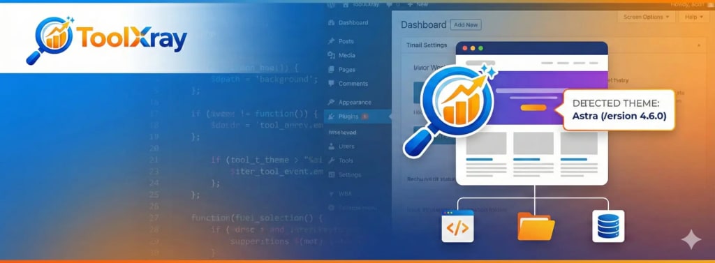
Method 3: Use ToolXray for a Complete Technical Audit
Google’s Mobile-Friendly Test and PageSpeed Insights are excellent starting points — but they only show you part of the picture. If you want to find every technical issue affecting your mobile experience and SEO performance, a full technical audit gives you the complete view in one place.
ToolXray’s free SEO Audit Tool is built specifically for this — it checks 80+ technical signals including all Core Web Vitals, TTFB, mobile performance, PageSpeed, broken links, missing meta tags, and more in under 10 seconds.
- Go to toolxray.com/seo-audit-tool/
- Enter your website URL in the input box
- Click Analyze
- Review your full technical report — mobile speed, LCP, INP, CLS, TTFB and more
- Use the results to prioritize which issues to fix first

Check Your Mobile Performance Right Now — Free
LCP, INP, CLS, TTFB, PageSpeed and 80+ technical signals — one free scan, no signup needed
Method 4: Test Manually on Your Phone and Chrome DevTools
Sometimes the most reliable way to check if your website is mobile friendly is to simply use it like a real visitor. Automated tools are excellent at measuring technical metrics — but they cannot replace the experience of actually trying to read an article, fill in a form, or tap a button on a real phone.
Manual Phone Test — What to Check:
- Does the text fit on screen without sideways scrolling?
- Is the font large enough to read without zooming in?
- Are buttons and links big enough to tap accurately with a finger?
- Do images load correctly and not look stretched or cut off?
- Does the navigation menu open and close properly?
- Does the page load in under 3 seconds on a mobile data connection?
- Can you fill in forms and complete actions without difficulty?
Chrome DevTools Mobile Emulator (No Phone Needed):
- Open your website in Google Chrome on your computer
- Press F12 to open Chrome DevTools
- Click the Toggle device toolbar icon (looks like a phone + tablet)
- Select a device from the dropdown — iPhone 14, Samsung Galaxy S21, etc.
- Your site now renders exactly as it would on that device
- Check all the manual test items listed above in the emulated view

Most Common Mobile Problems and How to Fix Them
Page Loads Too Slowly
Install LiteSpeed Cache → enable image optimization and lazy loading. Compress images before uploading using Squoosh (free). Remove unused plugins. Target: under 3 seconds load time.
Text Too Small to Read
Set base font size to minimum 16px in theme settings. In Elementor or WordPress Customizer → Typography → increase font size for body text and headings.
Buttons Too Small to Tap
Google recommends minimum 44×44px tap target size. Increase button height and add padding around links. Spacing between tap targets should be at least 8px.
Images Too Large and Slow
Enable WebP format in LiteSpeed Cache settings. Never upload images wider than 1200px. Enable lazy loading so below-fold images only load when scrolled to.
Horizontal Scrolling Required
Usually caused by an element wider than the viewport — a table, image, or code block. Add max-width: 100%; overflow-x: auto; to the problematic element in your CSS.
Layout Broken on Mobile
Your theme may not be fully responsive. Switch to a modern responsive theme or use Elementor’s responsive controls to set different layouts for mobile and desktop.
What Is a Good Mobile Score in 2026?
The most common question after running a mobile check: “What score should I actually aim for?”
| PageSpeed Score | Reality Check | Priority |
|---|---|---|
| 90–100 | Excellent — better than 90% of websites | Maintain — you are ahead of competitors |
| 75–89 | Good — most visitors won’t notice | Nice to improve but not urgent |
| 50–74 | Noticeable slowness on mobile | Fix the top 2-3 Opportunities shown |
| 0–49 | Actively hurting rankings | Urgent — address this week |
Quick Checklist — How to Check If Your Website Is Mobile-Friendly Right Now
Use this checklist to audit your own website right now:
- Google Mobile-Friendly Test passes ✅
- PageSpeed Insights mobile score is 75+
- Page loads in under 3 seconds on mobile data
- Text is readable without zooming
- Buttons and links are easy to tap
- No horizontal scrolling needed on any page
- Images load correctly on mobile
- Navigation menu works on mobile
- Forms can be completed on mobile
- Core Web Vitals pass in PageSpeed Insights
Low mobile scores? Your hosting may be slowing you down.
ToolXray runs on Hostinger’s LiteSpeed servers — optimized for WordPress mobile performance. NVMe SSD, free CDN, PHP 8.x. Starting at ₹69/month.
Advanced: Check Mobile Friendliness in Google Search Console
For site owners who want to check mobile-friendliness at scale — across all pages at once — Google Search Console provides the most comprehensive view.
- Go to Google Search Console
- Select your property
- Go to Experience → Core Web Vitals in the left sidebar
- Click the Mobile report
- See which pages are rated Poor, Needs Improvement, or Good on mobile
- Click any URL cluster to see the specific issues affecting those pages
The Bottom Line
Knowing how to check if website is mobile friendly is one of the most important things you can do for your SEO and user experience in 2026. With over 60% of web traffic coming from mobile devices and Google using mobile-first indexing, a site that fails mobile checks is actively losing rankings every single day.
The fastest way to check if your website is mobile friendly is Google’s free Mobile-Friendly Test — it takes 60 seconds and gives you an immediate pass/fail from Google itself. Then run PageSpeed Insights on your most important pages to check your mobile performance scores. Use ToolXray for a complete technical audit that covers everything in one place.
Most mobile issues are fixable with standard WordPress plugins — once you know how to check if your website is mobile-friendly and identify the specific problems and theme settings — no developer required. The important thing is to run the checks first so you know exactly what needs fixing.
📱 Check Your Mobile Performance Right Now
Free technical audit — Core Web Vitals, mobile speed, LCP, TTFB and 80+ signals
Run Free Audit at ToolXray →Related Articles
How to Use PageSpeed Insights
Read your PageSpeed report correctly — understand every metric and prioritize fixes.
Fix LCP in WordPress
LCP is the most important mobile performance metric — exact fixes for WordPress sites.
WordPress Speed Optimization Guide
Complete guide — caching, image optimization, JS deferral, CDN and more.
Why TTFB Is Critical in 2026
Slow server response kills mobile scores — here’s how to fix TTFB on WordPress.
Complete Technical SEO Audit
Beyond mobile — crawlability, indexing, schema and all Core Web Vitals together.
Free Alternative to Ahrefs
Monitor your mobile SEO performance for free — no expensive subscription needed.
WordPress Images Not Showing
Broken images on mobile? Fix them fast — cache, permissions and migration causes.
Fix INP in WordPress
INP is Google’s newest Core Web Vital — affects mobile interaction scores directly.
WordPress Theme Detector
Find which theme is causing mobile issues — detect any site’s theme instantly.